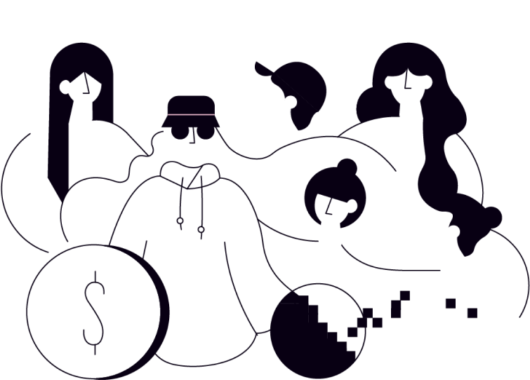

Currency can teach us so much about culture — past, present, future. Things change, but so much can stay the same. Paper bills turn to digital dollars. Old school mints, now new school codes. Ancient stackable coins, now blockchain.
We make the cryptic and confusing feel tangible, understandable. We turn crypto noobs into savvy investors. For those curious enough to enter, Okcoin is a portal to this new world of wealth creation. One where everyone is welcome to find their fortune.
When using Okcoin in body copy or headlines, it is to be capatalized as a proper noun. The logomark is to remain lowercase.
To preserve the okcoin logo’s integrity, always maintain a minimum clear space around the logo from competing graphic elements such as other logos, copy, photography, or background patterns that may divert attention. The minimum clear space for the okcoin logo is defined as one center square within the logomark.
This minimum space should be maintained as the logo is proportionally enlarged or reduced in size.
Our secondary use logo is a vertical treatment and is to be used when the horizontal logo is not appropriate.


These are the four most common color uses of our logomark. Always be sure to use with a level of high contrast.
Galano Grotesque is a geometric sans by Studio René Bieder. It has a modern streak which is the result of a harmonization of width and height especially in the lowercase letters to support legibility.
Galano Grotesque features circular shapes and a large x-height, resulting in a highly legible font. The geometric appearance is combined with a compact look, which is the result of a short descender/ascender as well as closed apertures.
DM Mono, by Colophon Foundry, is the monospaced member of the open-source DM superfamily from Colophon Foundry. Other members include DM Sans, DM Serif and DM Serif Display. DM Mono is available in three weights with matching italics.
